If you want to plan a website makeover or full redesign, you might want to read through my experience over the past 2 years, some fixes, complete changes, and updates I’ve made….
The results have varied wildly throughout all makeovers and increased my launch budget different depending on how + when I planned them.
I think we can all agree that there are tons of costs associated with launching online.
And if you’ve launched more than once, then you know that choosing where that money gets spent is super important.
You might make your decision on whether it directly leads the outcomes you want on a launch — say making more sales or getting more subscribers.
One piece that always comes up for me (almost every launch) is the sales page, sales site, and any webpages related to the launch itself. It’s like a switch flips on and I start thinking about how to make it all look better.
And it’s natural to do that – to want to put your best foot forward.
This urge has gotten stronger for me since focusing on my business 100%.
But is it a necessary urge? Or an unnecessary distraction?
Where’s the proof that we really need a hot sexy website to have a successful launch?
There are certainly plenty of people on the interwebs who I personally admire that seem to do just fine with pretty basic websites.
Of course there are others with public transformations that are turned into huge online events and seem to make us salivate for some reason.
C’mon….Are they making any money really? Or any extra money?
What kind of results are possible when you do put a little care into those external pieces of your business?
Here’s what’s happened to me over the last few years and the few external improvements I’ve made.
It’s taken me a long time to embrace wanting to make changes.
Please note: your own ROI (return on investment) will likely be different from mine, so please understand that the results I’m sharing today are not guaranteed or likely even typical.
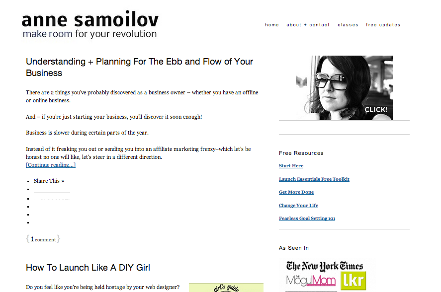
Makeover #1: annesamoilov.com
The first official makeover happened in mid-2012 for my main site was annesamoilov.com. I hired a designer/developer to take my out of the box Thesis site and transform it into something that was a similar, but simple version of the same site with a bit of visible design changes.
I wasn’t ready for a complete head to toe transformation, so we worked together to create a better version of what I already had going.
Confession: I was nervous about making the site all super pretty and different, because I didn’t want to alienate or turn people off who’d been reading for awhile. I had so few subscribers and I was worried that I would lose them all because I changed my site…. I was so personally tied to the site that I felt like it needed to reflect me. This was a huge mistake, because it stopped me from making any drastic changes…
Take a look at the before and after…
(hello Thesis Theme out of the box!)
You see that I still have a ton of white space from the beginning image to what it currently is….
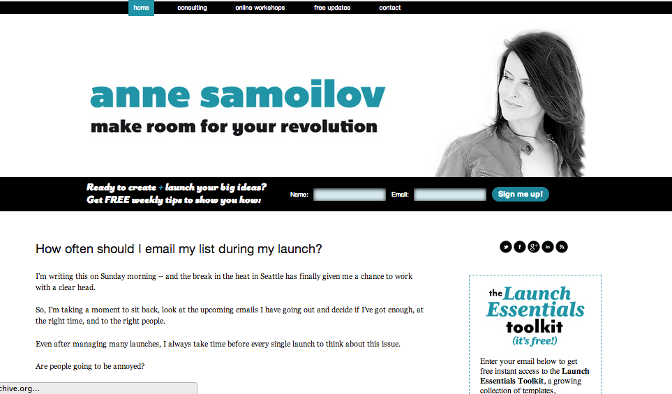
(after my first bigger makeover in 2012)
Add a little flair of color, lose the image of me with sunglasses…and now I’m even looking directly at the viewer which is a change I purposely made from feedback and research done about where your “gaze” is on a website..
(pretty much how it is as of the end of 2013)
My results: a few bigger traffic spikes during the month I relaunched the site and now an ongoing stream of subscribers. Both traffic + subscribers continue to grow.
More importantly – I became more confident and clear that my simple layout was a choice (this had always been a weird thing for me thinking I was being lazy or too meek in my web presence).
Sales? Not really but it didn’t hurt to bump up my visibility in the summer months before my Fall launch.
Makeover #2 Fearless Launching
Probably the most dramatic of changes has happened with my signature program Fearless Launching…but it happened over time.
In fact – the time dragged and I was never quite happy with how things looked.
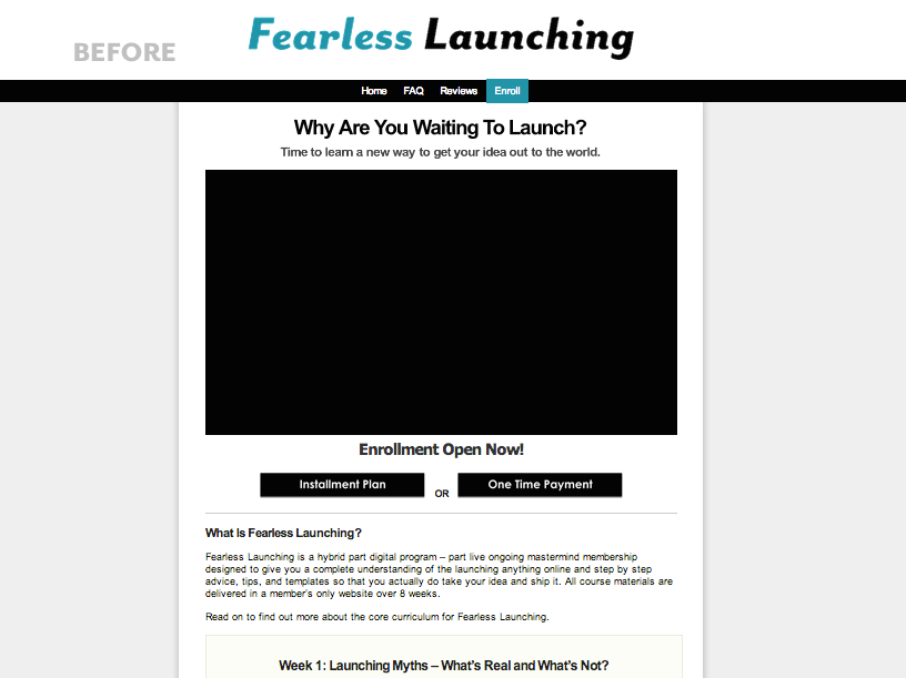
When I first created Fearless Launching, I had the idea that I wanted it to be an accessible and easy to deliver program. Everything about the marketing and sales page had to have the same feel.
So when I launched the program in 2012, my sales page lived on a simple wordpress page inside my main site.
You can see that the page was an outline and bullets. I think it even looks like a blog post almost!
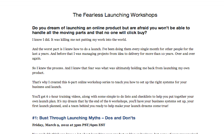
(no images, no testimonials – just the “here’s what I got”)
One thing I think is important to point out is that I was still able to fill 20 seats in my first time launching the program–and with a small list + limited visibility.
However – going back in time – I would have spent more time on this page and positioned it a different way.
Instead of making it feel like individual workshops, I would have tied together what the outcomes were for going through all the modules.
And – I would have highlighted my work on the B-School launches and provided some testimonials.
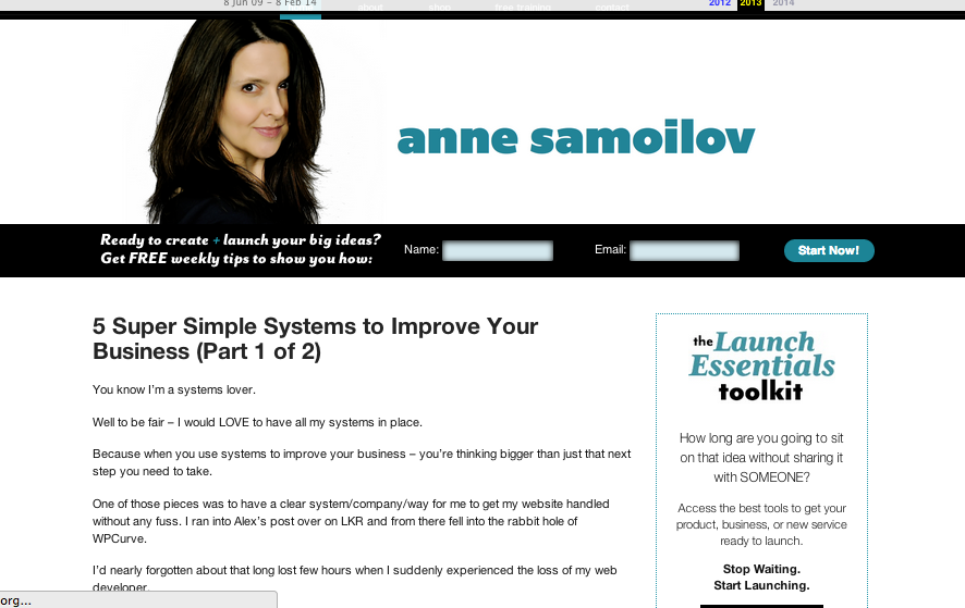
By 2013, I started to make some improvements…I moved everything over to an optimize press theme and set up a stand alone domain for the program. I wanted to give the program it’s own home!
Here’s the site sometime in 2013 – you see a video at the top, a very optimize press looking layout and the bones for what exists now. Mostly text.
Again – I made sales – even increased enrollment for both launches during 2013…and continued to use this basic layout throughout the entire year. Remember – I even wrote about a post about the truth most copywriters don’t want you to know about that sales page.
2014 something shifted for me. I was ready for a more visual look – had been taking more photographs during the year prior, was loving how to use my own photos in my blog posts…saw how images were being used in other sites.
I had the desire to makeover my sales site but didn’t know how it would happen.
I was very cautious too.
I knew that jumping into a design project only a month from launch might not be the smartest thing to do. So I told myself, if the right person shows up, this will happen.
If not – no changes are allowed. Luckily I did find the right person.
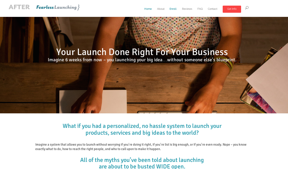
(current site using elegant themes “divi” theme )
This new site included me adding more images, a little fancy parallax effect, a NEW action color for my brand palette, and updating the copy throughout.
Results from the website changes: more traffic and eyes on the offer. I ended up with 40 new people in the program, the traffic to my launch site doubled from the last launch, and the number of subscribers during the launch there were some great increases too:
Fall 2013 launch – I tracked about 1 month from open cart through the end of the launch and under 500 new additional subscribers.
Spring 2014 launch – I did the same thing, backing up about 1 month from the open date and there were 1500 new additional subscribers.
Interesting data – but I still caution you to attach it to the updates made to the site!
(Don’t worry – I’m going to do my entire launch post mortem for you in a few weeks once all the stats are in!)
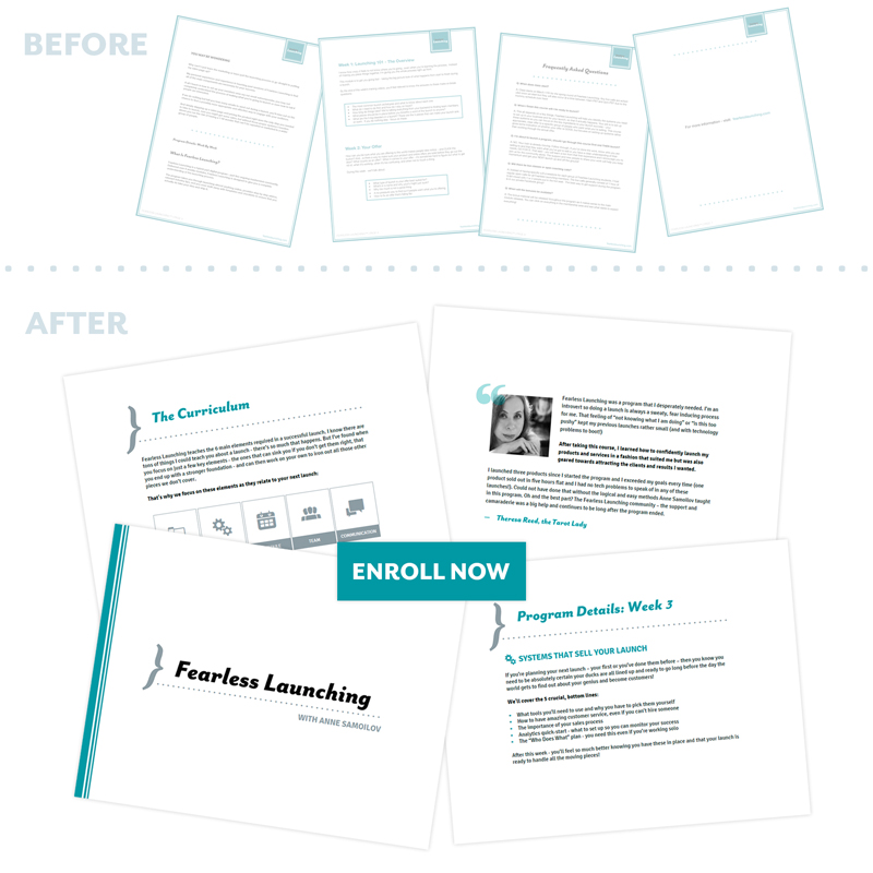
Makeover #3 Fearless Launching Program Tour PDF
Back in December we created a simple curriculum pdf that was part of our early bird launch. We did it without the help of a designer, but it worked well enough and a few people even told us they purchased as a direct result of reading through the pdf.
Score! Specific win using this new pdf.
Because we got specific feedback from this pdf, I figured it was worth it to spend more time and money on refining the design/layout love, so brought in a woman who made my dream a reality. Here’s how that looked too:
Why did I make all these changes?
People expect to see improvements. Improvements help build excitement. The site and the pdf had proven to help people make their decisions about the course and thus I knew spending some money to improve them would likely lead to more sales in the end.
The bigger outcome though was me feeling stronger, more confident and more excited about the launch…which also shows and leads to a better outcome.
Results over time: Sales have always been steady and solid for Fearless Launching. I launched 4x over the course of the time I worked full time and my student levels went from 20 to 40, all while I raised the price to match the content.
But Fall 2013 felt a slight dip which obviously worried me a little, not to worry though because Spring 2014 resurged…
Was it because of the new site?
I’m not so sure really. There are so many things that have happened over time to the program, my business…
-
list increased
-
traffic increased
-
more people became aware of the program
-
new podcast this year
-
consistent communication (including more social media interaction)
-
lots of interviews went live in 2014
-
improved our SEO efforts on the blog
So does a pretty site make more sales? Lessons Learned…
I remind myself of these important ideas related to getting results and testing ANYTHING in your business.
1. If you are doing multiple activities to raise your profile, it’s a little difficult to tell exactly what pushes the meter up and there’s usually a mix of things that help you improve your business, it’s the mix that is unique to every single business.
2. This is exactly why split testing and testing of any kind is done at the micro level–so you CAN tell what created the better results. Add things slowly over time so you can see where the lever tips in your favor.
3. Business improvements like branding and the visual style of your website – may not have an obvious impact on your business in terms of immediate sales, but I think a strong, visual style does raise the level of your business and positions you to get those sales down the road.
4. Tracking data is crucial to figuring out what worked and what didn’t. I will be the first to admit that starting in JUST December 2013, I started doing a better job of watching the numbers, conversions and connections between subscriber rate + sales. Even just a year ago I wasn’t properly looking at my conversions or setting up the right goals in Google Analytics.
I highly recommend you read a book like Paul Jarvis’ Be Awesome at Online Business – it was actually a conversation with him that made me start paying attention to the visual language (and lack of on my own sites) and want to raise the game.
I’m still working on the homework he gave me then, but I’m pretty glad I’m at least paying attention now and making changes where I can!
What do you think?
I’d love to hear from you. Have you done any kind of website makeover to great results? Were the results revenue…or something else? How do you track your progress?
I love your new website and the post about redesigning your website. It does look great. I decided last year that I was really tired of my website and revamped it myself using wix.com. It hosts my website aswell. I loved it so much, that I created another site for my products and programs that were nothing to do with Relationship Coaching. I love Wix but was really disappointed with the way the url has to be displayed.
Love the look of your Course Material aswell.
Ann, I have a mail box folder called ‘Read Tomorrow’ what goes in there inevitably never gets read but my intentions are good. Emails from you were some of the ones that got placed in this cherished folder. The reason being is when I looked at them they were very text heavy and I immediately felt I did not have time to read them even though the topic was something I was interested in. Since you changed the design I now read them – even though they probably have the same amount of text.
I teach people how to create online magazines and I always stress how important visuals, bold headlines and white space are for giving the reader’s eyes a ‘break’ and not feel they are running a marathon! Your new design does that. Result; I signed up to your program this year!
Woo hoo! Now that is a result! Thanks Rosie for your comment – and as you know I KNOW you’ve been on my list for awhile, so this really great to hear.
As someone who runs a web design business, I love reading about this sort of thing, and the actual results after a website transformation.
We recently re-designed a Wishlist membership site for a client running an eCourse for a second time. Her first time running the course she had a simple webite she set up herself. It was branded with her logo, fonts and colors and looked ‘good enough’, but very little extra graphic design enhancement to take it to the next level.
In following up her her after the her sales period ended, she had 30 more signups for this round than the previous round (which is pretty considerable for a $1000 product and one where she’d actually raised the price several hundred dollars from a previous round).
As part of her design/development team, this is awesome to hear, and I believe the professional design certainly helped her raise the perceived value and professionalism of her course, but certainly there were other factors to the success as well.
The second time around she had more testimonials, more bonus materials to offer, more affiliates as well as having refined the content from the previous round.
Clearly it wasn’t all design (though I think that certainly helped). These days, I believe having a ‘clean’, modern, professional and well branded website is basically the minimum requirement to getting taken seriously online. This is not to say one can’t be successful with a simple but consistent looking DIY site, and of course there are exceptions, but in most cases, this foundation is the same basic minimum requirement having a college degree is (or used to be) in getting an entry level office job in the US.
Up-leveling branding and website for many of my clients is a total game-changer in the world of online business, both in terms of customer sales as well as getting taken seriously by peers/colleagues, potential partners, and mentors… and most importantly in their own minds. I see this huge change in confidence happen when clients suddenly have a brand and online presence that authentically represents who they are and the work they’re doing in the world.
That said, people who just go out and spend a lot of money on a flashy new web presence, but aren’t clear on who they are, who they seek to serve and what their offerings are, often end up throwing their money away on a new website and building what I call a ‘hollow brand’, and they often end up doing another re-brand far before they would typically need to.
This is such a great response…thank you so much for sharing. Right after posting this blog post, one of my newest customers emailed me saying that the new more visual style is one of the main reasons she finally bought my program Fearless Launching…so I guess that’s all I need to hear!
Happy to be moving in the right direction…
Again thank you so much for sharing such an in depth response!
I think it looks great. I’ve only ‘known’ you with your current look 😉